I am planning to start advertising more for my shop and blog and have been reaching out to other blogs to see if they would be willing to feature me, as well as looking into advertising on Project Wonderful. The first thing I realized I would need was a button ad, one of those little 125 px by 125 px ads you always see in rows down the sides of all your favorite art and craft blogs. I knew the picture I wanted to use and that i very simply wanted it to say "Cursive Arts" at the top, and, of course, that I wanted my lovely husband to design because he is amazing at what he does and while I could have easily cut it down to that size by myself and typed the wording I needed across the top, he could make it look good.
Somehow, I always manage to forget having my husband design something for me is never that simple. For one, he treats it like I am a client, not just his wife, who isn't going to give him any money for his time. Therefore, he takes it very seriously which usually means what could have been a five-minute job that looks decent becomes a hour-long job that looks fantastic.
But there's the downside. For one thing, my husband and I do not always have overlapping design tastes. He likes that rounded version of courier, while I like that thinner one. He is looking at grey-greens while I'm pleading him to go back to that orange he had up for a moment. "It''s too bright!" he argues. "That clashes!" he points out. And that's just the beginning. He is also a perfectionist, so while I would have been happy with just text at the top, suddenly it becomes two different fonts, a fade, and this and that, which is awesome, but suddenly everything has gotten much more complicated than I intended and it's past midnight and I'm sleepy and wishing he would be done. (On a side note, if any one ever needs a motion graphics/graphic designer, now you know my husband will work until you are absolutely satisfied, and as I said before, he is good. And yes, that needed italics).
And the final thing: he's a brand steward. Suddenly, designing this little logo that will barely be an inch by and inch on the average computer screen, isn't just about designing a logo. It is now about making a brand for me. Now he's asking me what my brand represents, how I would describe it, what it is meant to symbolize. This is both the up and down of being married to a talented graphic designer. Yes, I'm going to get an awesome logo, but it's become entirely more complicated, we're not agreeing on half the design elements, and he even called me a 'problem client' at one point (which, in his defense, is undoubtedly true).
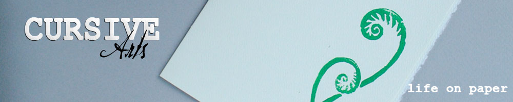
It's nearly one in the morning on a weeknight, and we're talking about what my brand signature should be. And nn the end, all that designing came down to this little square.

So right now, it's "Cursive Arts: Put a pen to it." Not bad, not bad at all, for it being past bedtime and spur of the moment. However, while I love the design, I think the signature could be better. I would not mind something more all encompassing since, while the majority of what I make is notecards, I would prefer people not add any of their own ink to my other works. If one of you lovely readers can come up with a phrase to describe my work that I like better, I'll send you any notecard four-pack of your choice from my shop. Deadline is next Tuesday, and feel free to spread this about, because the more brains the better, right?
Haha, I know how you feel. Except I'm a graphic designer and do my own stuff. When I come up with a new logo concept, not only do I have to perfect the original version, I then have to make it in several sizes to fit all my online venues. There goes my day.
ReplyDeleteAs for your stuff, it seems like the notecards and shadowboxes are all based on relatively simple organic designs, and most only have one color, so how about "beautifully simple" "naturally elegant" "clean and simple" or something along those lines?
The first thing that pops into my mind is "With love and italics."
ReplyDeleteLife on paper? Beauty on paper?
ReplyDeleteI also like "With love and italics" :)
I like "Life on paper." I've also derived "Organically simple" from what KZ said above. Hmm, I might have to run a poll on Facebook.
ReplyDelete